Data Practices Chapter 4 – Planning and Performance Monitoring
- Date: February 18, 2022
Jump to section
Transit service planning and performance monitoring are easier with more data. Using this Guidebook, agencies can tap information on their customers, performance, and asset conditions using a variety of data collection and management practices. With this data in hand, agencies can address central questions of transit planning: Who rides transit? Where do they want to go? For some small agencies, the first-hand experience of drivers and agency staff can begin to answer these questions. However, data-driven planning decisions are the key to leveraging limited resources to the greatest benefit for all users of a transit system.
Data- driven planning decisions are the key to leveraging limited resources to the greatest benefit for all users of a transit system.
Planning:
Population, Employment, and Land Use
U.S. Census data contains detailed socio-economic information on. Planners identify major trip origins and destinations using this data and then modify service to generate increased transit demand.
Ridership Forecasting
Ridership impacts of service changes can be estimated using just existing ridership and a few common demand elasticity values.
Transit Demand
Existing ridership data is the clearest indicator of demand for transit. Analyzing this data involves aggregating ridership data to observe patterns of demand.
Travel Demand Patterns
Using model data provided by state or regional planning bodies, agencies can identify important connections and design transit services to accommodate those trips.
Capital Planning
Once transit assets have been inventoried and assessed, agencies can put this data to work to plan for investment needs in the years to come.
These findings are from the Data Practices Guidebook. The Guidebook is a resource to assist small urban, rural, and tribal transit agencies in understanding and applying good data practices.
Performance Monitoring:
Ridership Data
Ridership performance can be evaluated by identifying trends in ridership totals, measuring passenger load and service capacity, and calculating service productivity metrics.
Schedule Performance Data
Performance monitoring of actual schedule data allows agencies to evaluate service as it is delivered to customers. With these measures, agencies can work to improve services.
Financial Data
Monitoring financial performance helps agencies keep their budgets in check. Farebox recovery is one of the most important financial performance indicators, among others.
Introduction
Transit service planning and performance monitoring are easier with more data. The data practices outlined in the previous chapters of this Guidebook provide agencies with the means to tap into information about the ridership, operations, assets, and financials of their transit service, as well as the characteristics and needs of their current and potential customers. With this data, agencies can use analytical practices to inform the service planning process and monitor the performance of existing services.
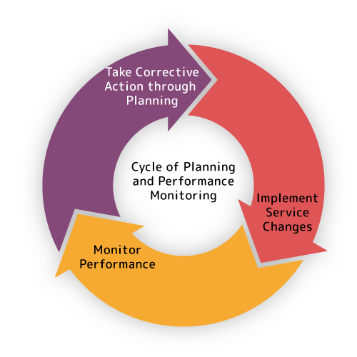
Planning and performance monitoring are closely intertwined processes linked through data. When agencies conduct service planning to realign routes, change the frequency or span of services, or make other modifications, they can use data on existing ridership, demographics of the areas served, and other performance statistics to guide these decisions. Once services are implemented, performance monitoring data informs evaluation of the changes and suggests routes or portions of the service area that may need further service planning attention.
While the use of data to inform these decisions is not new, the richness of new data sources provides agencies with the ability to conduct more precise evaluations of performance and to plan services with greater clarity. For instance, monthly ridership averages can be supplemented with trip-level overcrowding statistics from Automatic Passenger Counters, while Location-Based Services (LBS) data can provide more insight on passenger travel than Census travel data alone. Even if an agency does not make use of new methods, a facility with data practices can speed the reporting of data for performance- based grants, planning studies, and other requirements.
Even as they provide more insights, the ever-larger and more complex datasets discussed in this Guidebook place new burdens on agencies. Working with data like this requires both technology investments and staff know-how. This Guidebook provides a range of data practices for planning and performance monitoring, some of which may be readily implemented and others that may require the help of outside partners. In Chapter Five, partnership opportunities for building working relationships around data will be discussed in additional detail.
Planning
For transit service planning, data provides key insights for decision-makers when designing and evaluating service changes. Though some data like ridership and revenue hours will be tabulated by the agency itself, external datasets such as Census population and employment estimates will play a role in many planning decisions. As services change and fleets age, future year capital investment needs can also be made on the basis of asset inventory and condition data. The key data sources discussed in this Guidebook lend themselves to a broad set of planning methods, as outlined in Table 3.
Table 3: Data-Driven Service Planning Methods
| Category | Input Data | Method | Output Analysis |
| Ridership Analysis | Ridership data by location and time | Visualize where and when activity occurs using GIS software or in tables and charts | Transit demand: Where are customers using your services? |
| Ridership Analysis | Existing ridership data, existing and future fare and service level data | Estimate ridership using common elasticities | Ridership forecast: How will changes to fares or service levels affect ridership? |
| Market Analysis | Census data, land use data | Plot Census variables like population by their density or concentration | Market analysis: Where do potential customers live? |
| Market Analysis | Travel demand model, LBS data | Visualize travel patterns | Demand analysis: Where do people want to go? |
| Capital Planning | Asset condition, relevant financial data | Use Decision Support Tools to forecast capital needs, prioritize improvements | Financial forecast: Transit Asset Management Plan, Fleet Plan, and/or Capital Improvement Plan investment priorities |
Ridership Analysis
Ridership data is at the heart of understanding utilization and the demand for transit service. When considering service changes to a fixed route or the operational capacity of demand response services, planners can make use of agency-collected boarding and alighting data to evaluate how changes will impact ridership levels and service efficiency. Service changes also impact future ridership, which can be estimated from existing ridership data using common elasticities for fares, span of service, and frequency or wait time.
Existing Transit Demand
Demand for transit varies widely by the time of day, day of the week, and location. Data-driven planning decisions rely on ridership data with both spatial and temporal variation to understand these fluctuations in demand. With this information, planners can evaluate the frequency, span, and geographic extent of service. To evaluate the existing demand, planners may use data from any ridership data source, including ridechecks, electronic passenger counters (EPC), automatic passenger counters (APC), or trip logs for demand response services. Spatial data may be present in the form of stop identifiers or coordinates, while temporal data may be represented by a timestamp, a date, or a specific trip identifier.
At the greatest granularity, fixed-route transit demand can be analyzed for every stop, enabling a comparison of ridership levels between stops along a route. Boardings at the stop level can also be combined for all routes at each stop to gain an understanding of transit demand at a certain location, regardless of route. Demand-response transit demand can be analyzed at the pick-up/drop-off location level, enabling an understanding of where in the service area there is the greatest demand. With less granularity, planners may compare ridership between different routes or services or observe trends in route-level ridership over time.
Data Granularity and Resolution for Transit Planning
How data can be put to use is often a question of its granularity and resolution.
Data granularity
Data granularity is the level of aggregation in a dataset: each record may represent a unique stop, trip, vehicle, direction, or route. Granularity is important for nearly all planning applications since most measures can be analyzed at any level. Planners must choose the right granularity depending on the question they wish to answer, whether the analysis should be performed separately for each stop (high granularity) or for each route (low granularity). Highly granular datasets are the most advantageous for analysis since they can usually be aggregated to a lower granularity if needed.
Data resolution
Data resolution is the precision of a dataset: a smaller time interval or more precise coordinates would result in a higher resolution. High-resolution data is usually a characteristic of passive data sources, such as automatic passenger counting (APC). Most planning decisions can be made without high- resolution data, but agencies with greater data capabilities are starting to use such data for new insights. For example, a detailed spatial and temporal analysis of APC data enables planners to diagnose potential causes for bus overcrowding, such as dropped trips, demand variability on an hour- to-hour and day-to-day basis, and lack of headway adherence.
For instance, an agency may have highly granular data on stop-level ridership activity from a manual ridecheck, but this data may lack resolution because ridechecks are conducted infrequently. On the other hand, an agency may have high resolution, trip-level boarding counts from driver logs, but the data may lack the granularity of a stop-level ridership activity dataset.
A wide variety of analyses can be conducted to understand transit demand, depending on the level of aggregation and the time frame in question. First, ridership data is aggregated to the desired level of detail by taking the sum of all boardings for a stop, trip, or route. Then, the data is summarized temporally, whether planners need the information broken out by the time of day, day of the week, or at a larger scale such as months or quarters. If coordinates are available, the data can then be plotted using geographic information system (GIS) software to show where transit demand is the greatest.
The planning applications for existing transit demand analysis include evaluating changes to the span and frequency of service, capacity analysis, and bus stop planning. Bus routes with high demand may warrant higher frequency or larger vehicles to meet capacity needs. Conversely, routes with low ridership may require new approaches to attract riders or may be candidates for elimination or conversion to demand- response, micro-transit style services. At the stop level, planners can analyze demand to prioritize implementation of stop amenities or to identify stops for removal when consolidating stops on a fixed route. At the trip level, high ridership at the beginning or end of the span of service may suggest extending the hours of service or modifying the frequency of service during particular time periods.
Visualizing Transit Data
Transit data is often multidimensional, containing quantitative measures, geographic locations, and temporal information with every piece of data. Agencies must distill this data to communicate clearly with stakeholders and the public and inform decision-making. The richness of transit data often requires more information-dense graphics, charts, and maps, though these can be more challenging to produce. Effective data visualizations are:
- Easily digestible by the intended audience
- Understood independently of other visualizations
- Clear in purpose and message
- Aesthetically attractive.
Most transit data contains two key components for visualization: time and space. Combined, these two elements produce rich illustrations that communicate many layers of information.
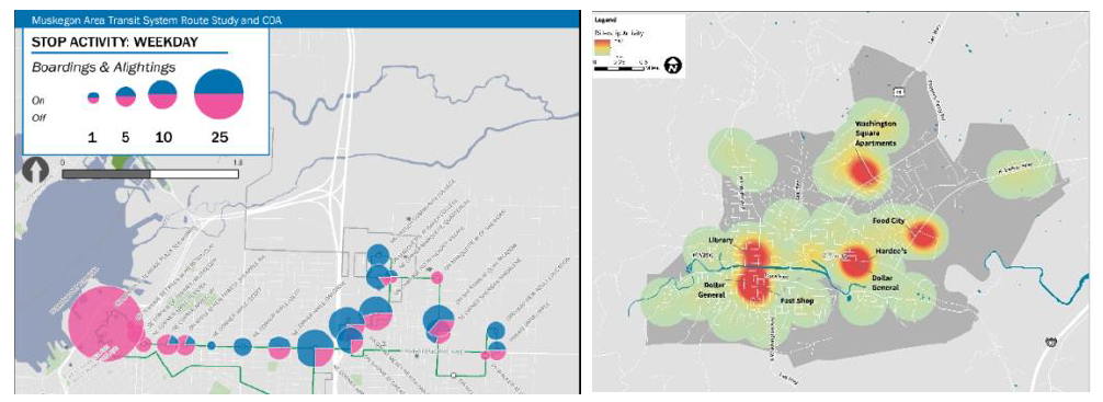
For high-resolution data, time can be visualized using one axis of a graph or table, such as in Figure 24. For low-resolution (or aggregate) data, variations in data over time may be shown by repeating a visualization for each time period. For example, a map of ridership levels may be repeated three times to show weekday, Saturday, and Sunday data separately.
Space is often—but not always— visualized on a map. As demonstrated in Figure 25, a map provides geographic context to data, enabling readers to relate the data to their own familiarity with a location. Alternatively, the spatial element of a dataset is sometimes one-dimensional, allowing for space to be represented by one axis of a graph or table. For example, the boardings at stops along a route may be visualized using a bar graph since there is one spatial dimension: distance traveled along the route.
Ridership Forecasting
When riders choose to use transit, they often compare the cost of transit to other transportation options— or not making a trip at all. The cost to the rider is not just the fare but also the time spent in transit. In addition, the service must be available when and where the rider needs it. Ridership depends on these factors, and service changes that alter the fare, wait times, or overall availability of service will result in impacts to ridership. While there are many ways to estimate future ridership, changes caused by fares, wait times or frequency, and span of service can often be forecast by simply applying a common demand elasticity to existing ridership data. More information on demand elasticities can be found in the following call-out box.
Other methods of ridership forecasting are available that require more data and technical expertise. Software such as STOPS (Simplified Trips-on-Project Software), created by FTA, and TBEST, created by the Florida Department of Transportation, enable agencies to include the impacts of population, land use, and geographic coverage in ridership estimates for fixed-route services. For demand response services, some research has also provided methods for calculating ridership based on population, fares, reservation policies, and other service characteristics.
52 Todd Litman. 2004. “Transit Price Elasticities and Cross-Elasticities.” Journal of Public Transportation,7 (2): 37-58. View the reference document here (external link)
53 The National Academies of Sciences, Engineering, and Medicine. 2004. “TCRP Report 95: Traveler Response to Transportation System Changes Handbook, Third Edition: Chapter 9, Transit Scheduling and Frequency.” Washington, DC: The National Academies Press. View the reference website here (external link)
54 National Center for Transit Research. 2016. “Estimating Ridership of Rural Demand-Response Transit Services for the General Public.” Fargo, ND: Small Urban and Rural Transit Center. View the reference document here (external link)
Market Analysis
In addition to understanding the existing demand for transit, planners often aim to increase ridership by leveraging the potential market for transit. A market analysis evaluates who would be likely to ride transit, where they live, and where they want to go. Typically, many people within the market who would ride transit do not currently do so. Since agencies only collect data about current users of their services, planners must turn to external data sources, such as the U.S. Census and regional transportation demand models.
Population, Employment, and Land Use
The transit market consists of two types of locations: places of residence and places of employment. Most transit trips begin or end at home. At the other end of the trip is almost always a place of employment, whether it is the rider’s own workplace or a business, medical center, or another point of service where others work. Therefore, understanding the geographic distribution of population, employment, and their corresponding land uses is critical to measuring the potential of the transit market.
The most consistent, reliable, and accessible data source for a transit market analysis is the U.S. Census, including the American Community Survey (ACS) and Longitudinal Employer-Household Dynamics (LEHD) datasets (see Chapter Three: Open Data for more detailed information). These surveys contain a wealth of information about population and employment estimates in the United States, with details on demographic information such as age, income, race, and vehicle ownership. ACS data is available for small geographic areas called “block groups,” such that planners may use this data to analyze population and employment at bus stops or for individual neighborhoods. However, for more rural jurisdictions, the geographic size of block groups will still be impractically large for detailed analysis. In these cases, a simple examination of population counts at the “block” level will suffice. LEHD employment data is also available at a detailed block level, but many transit services will not be focused on the commuter market. In those cases, the locations of major destinations like grocery stores, hospitals and clinics, and other services can be used to identify the possible destinations of trips.
Market analysis must consider the unique makeup of the market for different transit services. For example, the market for a commuter service may consist of working-age adults, whereas the market for demand response or local bus service may be oriented toward non-work (shopping, medical, or recreational) trips by residents with limited access to a personal vehicle. A valuable source of data on the target market for transit service is on-board customer surveys. By evaluating what demographics of riders and which trip purposes are currently served, planners can conduct a market analysis that is most relevant to their community and make smart planning decisions.
Transit planners use GIS or other mapping software to measure the geographic distribution of certain demographics and places of employment. The density of both people and jobs are important market analysis metrics, as they indicate where there is a concentration of potential transit riders. The result of population and employment analysis is a picture of the areas with potential for transit demand. In some cases, these areas may already have high transit ridership. Comparing existing services and current ridership levels to these results enables planners to identify geographic gaps in the transit network or opportunities for increased level of service.
Travel Demand Patterns
If population and employment analysis shows the potential origins and destinations for transit trips, travel demand data shows the connections between those trip ends. Many states and regions maintain a travel demand model that produces matrices of the number of trips between each origin and destination zone within the region. Trips are categorized by purpose and mode, enabling transit planners to visualize and evaluate the potential demand for a transit service along a corridor or between two locations.
Transit ridership is highest when a service gets the most people where they need to go, and travel demand model data provides a wealth of information about the most common trips made by residents or workers in a certain area. Just like population and employment analysis, most of the flows in the travel model represent trips that are not currently made with transit but could be if there was a service to those origins and destinations. Planners can use travel demand data to identify key origin-destination pairs that could be served by transit, or at a higher level, entire corridors with high travel demand.
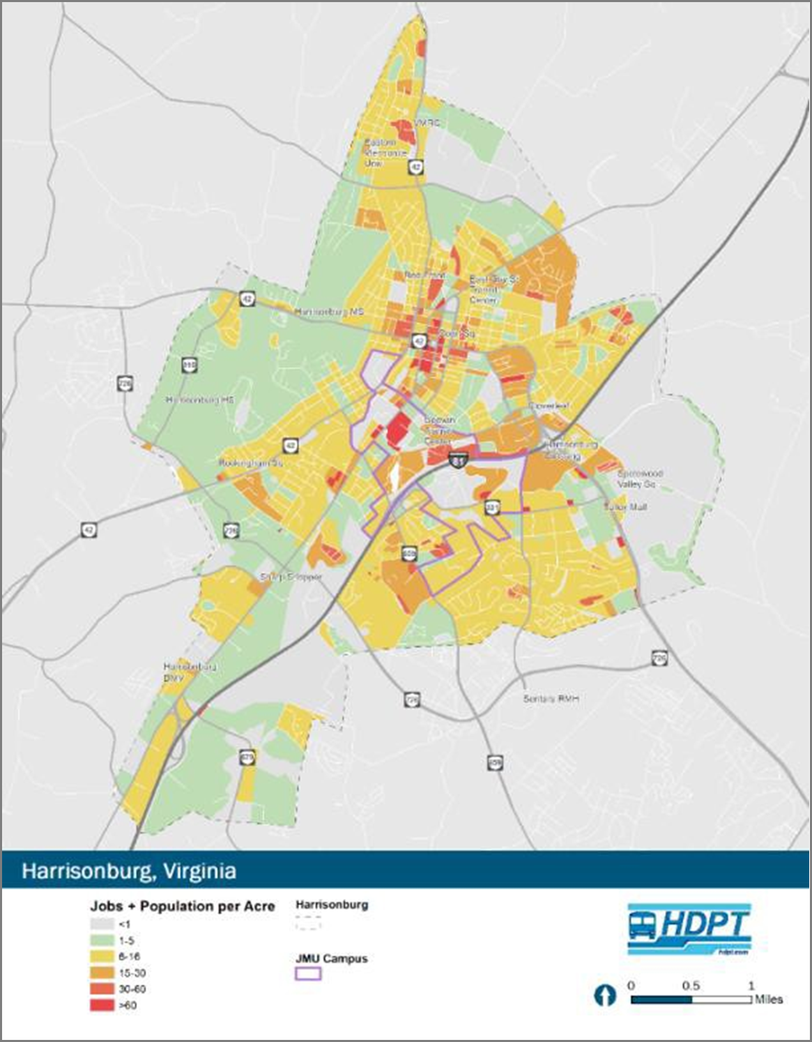
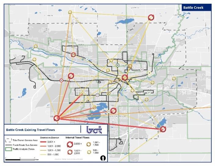
To analyze travel demand data, spatial visualizations are used to highlight connections with the greatest volumes of flows. When overlaid on the existing transit network, planners can more easily identify geographic gaps where many people are traveling, but there is limited or no transit service available (see example in Figure 27). Similar to U.S. Census data, travel demand data is available at a small scale, which allows for analysis at varying granularity. Many models also produce data by trip purpose or time of day, so that planners can drill down on travel patterns according to the specific types of destinations that should be served, and when during the day they should be served.
While calibrated based on real-world data, travel models do not necessarily produce results that match real conditions. Especially in future year forecasts, these estimates have non-negligible limitations and uncertainties. To address this shortfall, an emerging data source for analyzing travel demand patterns is aggregated cellphone location data (also known as location-based services datasets, or LBS), which produces travel volumes with actual observations for every individual trip captured. While this data must be purchased from private companies, this data can be used to understand travel patterns for a transit market analysis.
Capital Planning
Once transit assets have been inventoried and assessed, agencies can put this data to work to plan for investment needs in the years to come. Processes of investment prioritization vary widely across the transit providers; for rural, tribal, and small urban ones, state and regional government bodies have a large role to play in this process. Common to each prioritization process is an assessment of the cost to maintain agency assets in a State of Good Repair, as well as consideration of other priorities and criteria. These criteria may include regulatory requirements, new needs, customer service enhancements, or other criteria that may inform decisions. These decisions are often supported through software such as TERM Lite or the Transit Asset Prioritization Tool (TAPT) and codified in Transit Asset Management Plans and Capital Improvement Plans.
Outside of the investment decision-making process, asset and maintenance data have a role to play in reporting on the condition of the health of the fleet and its ability to deliver services to the public. A common metric reported at the agency or sub-fleet level is the Mean Distance Between Failure (MDBF). This figure is calculated by totaling the number of component failures onboard vehicles and dividing against the number of revenue miles traveled by the fleet in a given period.55 The resulting rate is a tangible indicator of how well maintenance procedures are preventing disruptions to service given the age of the fleet.
While asset condition is well understood to play a role in service delivery, to date, few agencies have attempted to tie asset conditions to on-time performance, ridership, or other service performance metrics. Often this is because data on a vehicle’s condition, a vehicle’s assignment to a route, and a route’s performance are tracked in a variety of separate data sources that are difficult to connect to one another at matching levels of granularity, if the necessary data exists at all. In time, agencies may be able to differentiate what share of on-time performance are due to mechanical issues and not due to traffic or dispatch challenges or understand the effect on ridership from the adoption of new, more attractive vehicles. While that trend continues to emerge, plenty of data remains for agencies to analyze in their performance monitoring programs.
55 For some agencies, failure of some component on a vehicle (e.g., the air conditioner) may not in fact result in a road call or delays to passengers. Instead, these agencies may also report the Mean Distance Between Delay (MDBD), which reflects only events that cause delays.
Performance Monitoring
As communities grow, travel behaviors change, and agency conditions fluctuate, so too do metrics like ridership, on-time performance, service efficiency, revenues, and costs. Transit performance monitoring is the process of reporting a set of performance measures repeatedly over time. While rural, tribal, and small agencies already report annual performance data to the National Transit Database (NTD) or for other state and regional transportation plans, performance monitoring programs are typically geared towards reporting on a more frequent, targeted basis to support adjustments to operations or near-term planning decisions. In this sense, the design of a performance monitoring program is a concerted effort involving not only data but also an agency’s broader goals and objectives.
However rural, tribal, and small urban agencies structure their performance monitoring efforts, new data sources provide new opportunities to gauge performance. Sensor-based data from automatic passenger counters enable nuanced capacity analysis, while high-resolution data from automatic vehicle location devices allow for detailed evaluation of on-time performance and runtimes. Automatic fare collection data facilitates analysis of revenue and cost-efficiency measures. Even without passively collected data, agencies can take advantage of regularly collected ridership, trip logs, and fare revenue data to analyze a robust set of performance metrics. The approaches for performance monitoring enabled by these datasets are summarized in Table 4.
Table 4: Data-Driven Performance Monitoring Methods
| Category | Input Data | Method | Output or Analysis |
| Ridership data | Ridership data (e.g., APC) by route and stop for fixed-route services | Calculate the passenger load leaving each stop | Capacity analysis: Whether your vehicles have enough space and run frequently enough to meet demand and meet social distancing requirements |
| Ridership data | Ridership data by hour for demand- response services | Visualize the number of trips per hour (e.g., heatmaps) | Capacity analysis: Whether driver shifts or passenger pick- up times need to be adjusted |
| Ridership data | Ridership data by month or year | Create a line chart of ridership over time | Trend analysis (by route or systemwide): How is demand changing over time? |
| Ridership data | Ridership data relative to peers | Use iNTD database to gather performance data about peers | Peer analysis: How does your system compare to peers? |
| Schedule data | Schedule adherence and runtime (e.g., AVL) data | Calculate rate of on-time performance | OTP analysis: Are routes arriving at time points on time? |
| Schedule data | Service produced and service consumed | Calculate common performance measures | Performance analysis: Do performance measures support changes to services? |
| Financial data | Fare revenue and operating costs | Analyze the difference between costs and revenues | Farebox recovery analysis: How much do fares offset operating costs? |
From a data perspective, effective performance monitoring makes use of metrics that are consistent, accurate, and frequently available. Before conducting a performance monitoring analysis, agencies should define a set of performance metrics that they will calculate for every analysis period, whether on a monthly, quarterly, or annual basis. Some agencies will set targets for each metric, such as an on-time percentage goal or a minimum farebox recovery rate. With consistent source data and consistent metrics, trends or patterns can easily be identified over time. Accuracy in performance metrics requires data with small uncertainty and ensures that high-quality data is compared to high-quality data. Frequently- collected data allows agencies to repeat performance analysis regularly. Together, these considerations help reduce the level of effort required to perform the analysis since the same calculations can be repeated each time a new performance monitoring period has been completed.
Ridership Data
Many key performance metrics use ridership data to give insight into changing transit demand and the productivity of routes or services. Ridership performance metrics may indicate the need for a change in the level of service, highlight areas with frequent issues, or reveal low-productivity routes that should be improved. For the collection of ridership data, agencies may use manual methods, such as ridechecks or electronic passenger counters (EPCs), or passive methods, including automatic passenger counters (APCs). Ridership performance can be evaluated over a variety of time periods, including service periods, days, months, quarters, and years.
Ridership Totals
Any agency that reports data to NTD is accustomed to calculating total ridership on an annual basis, but analyzing ridership totals at a variety of levels can provide new insights when monitoring performance. Annual totals, both systemwide and for individual services, are especially useful for long-term trend analysis. With this type of Rural Integrated National Transit Database (iNTD) data, agencies can compare ridership levels to peer agencies by calculating ridership per capita. However, if data is collected more frequently, short-term trends such as seasonal variations in ridership may become apparent. Additionally, agencies can quickly identify the impacts of service or operational changes on demand for their services. For demand response services, ridership performance can also be analyzed by plotting the geographic distribution of trips using GIS, including the frequency of pickups and drop-offs in each area.
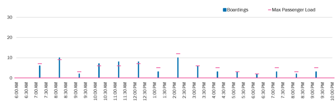
Passenger Load and Capacity
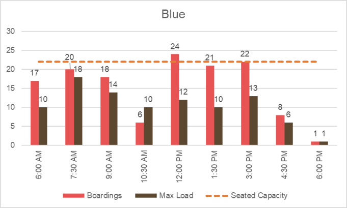
With boarding and alighting data at the stop and trip level, agencies can evaluate overall service capacity. Passenger load, which measures the number of passengers on a bus at a given time, is calculated by subtracting alightings from boardings at each stop as a vehicle travels along a route. When passenger loads meet or exceed vehicle capacity, a route may require larger vehicles or increased frequency (see example in Figure 28). Low passenger load may be important for social distancing, but many empty buses on a route may indicate a lack of demand. For demand response services, the service capacity can be measured by analyzing trip request data to identify the maximum number of trips that can be provided. Additionally, capacity can be measured using the average wait time for non- scheduled trips – excessive wait times can also indicate that there is greater demand than can be provided. If this is the case, agencies may consider hiring additional drivers or implementing computer- aided dispatch (CAD) for more efficient routing.
When demand outweighs supply: Pulaski Area Transit’s shift to fixed-route service
Pulaski Area Transit (PAT) in rural Pulaski, VA, recently switched from operating general-public demand-response to a fixed-route system. When operating only demand-response service, PAT received in excess of 700 calls per day for service and completed nearly 500 trips per day. This put tremendous stress on their fleet of nine vehicles and led to excessive wait times for passengers – often exceeding 45 minutes on busy days. Tracking their daily ridership totals and wait times enabled the agency to conclude that the demand in their service area far outweighed the amount of service they were able to supply. Subsequent studies, including a fixed-route analysis and a Transit Development Plan, recommended implementing the two fixed routes with a 30-minute headway each, which enabled a more efficient operation and less wait time for customers.
Service Productivity
The productivity of a transit service measures the number of passengers served relative to the amount of service provided. Common metrics for service productivity include boardings per revenue hour and boardings per revenue mile, as well as boardings per trip for fixed-route services. Higher productivity indicates a more efficient service that is able to provide more trips with the same resources. However, for demand response services, productivity may be directly related to how far passengers are traveling rather than service efficiency. Productivity can be measured at any granularity for which ridership data is available. By comparing the productivity of fixed routes, agencies can also more easily make planning decisions such as prioritizing routes for service improvements, planning level of service changes and identifying services for elimination.
Schedule Performance Data
Performance monitoring of schedule data allows agencies to evaluate service as it is actually delivered to customers. Schedule performance metrics can be compared to planned service, other routes, and peer agencies to determine the quality of service and identify areas for improved operations. The primary sources for schedule data are trip logs or automatic vehicle location (AVL) data. Using this data, planners can measure the actual hours and miles of service provided, on-time performance, delay, dwell time, travel speeds, and actual runtime.
Revenue Hours and Miles
Actual vehicle revenue hours and vehicle revenue miles are some of the most important metrics for any transit service. Beyond using this information for reporting, these measures are central to understanding differences between planned and actual service. Dropped trips, variations in runtimes, and other unpredictable influences on delivered service are often evident in revenue hours and miles. In addition, these metrics can be compared to peers to evaluate whether agencies of a similar size or in a similar geographic context are providing more or less service. Overall trends in revenue hours and miles also provide important context to other performance monitoring metrics. For example, increased revenue hours will typically correlate with an increase in operating costs. Moreover, revenue hours and miles are the foundation of many performance metrics, including service productivity and cost-efficiency.
On-Time Performance
Differences between scheduled and actual arrival times impact riders significantly, who can experience long wait times or miss the bus entirely when schedule performance is poor. The percentage of arrivals that fall within an agency’s defined on-time window, or the on-time performance (OTP), is a key schedule performance metric that centers on the passenger experience. Arrivals include every stop made by a fixed route service or all pickups and drop-offs for an on-demand service. On-time performance can be reported for individual trips or summarized across a longer time period. By measuring on-time performance trends over time, agencies can make operational improvements such as reducing boarding delays, schedule adjustments, or transit signal priority to improve schedule adherence.
Runtime and Speed
In addition to on-time performance, agencies use schedule data to measure actual runtimes and vehicle speeds. For fixed-route and demand-response services, accurately planned runtimes are critical for scheduling and maintaining on-time performance and accurate pick-up/drop-off times. Over time, road conditions, traffic patterns, and congestion cause travel speeds and runtimes to change, and agencies rely on recorded vehicle location data to determine how long it takes to run a route. Vehicle revenue miles divided by vehicle revenue hours may also serve as a proxy for measuring average travel speed while in service. As a performance metric, agencies may use runtime and speed data to identify where transit signal priority, stop consolidation, or other speed improvement measures are needed.
Financial Data
Basic fare revenue and operating cost data are often used to evaluate the financial performance of transit services. Understanding the financial state of individual transit services, as well as an entire system, are key to maintaining a balanced budget and planning future service within cost constraints. Financial performance monitoring can also help agencies compare their transit investments against peers and identify routes or services that have the lowest return on investment.
Cost Efficiency
Operating cost data at the route, service, or system-level enables agencies to calculate exactly how efficiently they are using resources to provide service. Three common financial performance metrics for cost efficiency are operating costs per revenue hour, revenue mile, and passenger trip. Over time, operating costs depend on the price of fuel, maintenance costs, wage increases, and other changes to operational procedures as applicable. Between routes, the cost per hour or mile may vary depending on travel speeds, delay, layover duration, and deadhead time and distance. By measuring costs on a per- hour and per-mile basis, planners can identify sources of costs and may be able to implement measures to reduce delay or minimize operational inefficiencies. However, some routes with higher operating costs may have a higher return on investment if ridership is also high. The operating cost per passenger, therefore, reveals a side of cost efficiency that is focused on serving the most passengers with the same resources. Along with reducing operational inefficiencies, agencies may also aim to increase ridership to best leverage their resources.
Farebox Recovery
In order to keep a balanced budget, agencies must track revenues as well as operating costs. Farebox recovery is one of the most important financial performance indicators, representing the ratio of fare revenue divided by operating costs. Although most agencies do not charge passengers the full cost of service, farebox recovery is useful for evaluating what percentage of the cost of service is covered by fares and using the data to forecast future revenues from new or changed services by estimating the farebox recovery.
Another metric for measuring farebox recovery is the average subsidy per passenger or the dollar amount of operating costs that are not offset by passenger fares. Since many agencies offer reduced or free fares to some passengers, keeping track of subsidy per passenger allows agencies to plan for financial trends in the relationship between fare revenues and operating costs over time for a balanced budget.
Identifying Peers for Comparison
“Compared to what?” is the key question underlying most data analysis. For many agencies, the value of a performance measure will be tracked over time, across routes, or relative to agency targets in order to provide insights on how the agency is performing. For the agency as a whole, comparisons to peers can provide a more holistic picture of how the agency performs, especially when factors outside an agency’s direct control (such as gas prices) are changing passenger behavior.
When conducting a peer comparison, determining the set of peer agencies to examine is often the most difficult step. While every agency faces a unique set of constraints and customers that make a true “apples-to-apples” comparison impossible, the Rural iNTD website provides a tool to make identifying peer agencies straightforward. For a given agency, the tool will assess the similarity of other agencies based on nine metrics in three categories:
Screening factors:
- Agency Type: Whether the agency is part of a tribe, local government, non-profit, private provider, or another agency type.
- Operates Commuter Bus: Whether the agency provides commuter bus service.
- Percent Motorbus Revenue Hours: The amount of service provided that is fixed route relative to demand-response service.
- Headquarters City in an Urbanized Area: Whether the agency is based in an urbanized area.
Similarity factors:
- Annual Vehicle Revenue Miles Operated: A metric that encapsulates each agency’s level of service.
- Percent 5310 Funding: Percent of operating funds sourced from federal support for the mobility of seniors and persons with disabilities.
- Percent local funding: Percent of operating funds from local sources.
- Population of Headquarters City: Because the specific extent of an agency’s service area is not reported in NTD, the population within the agency’s headquarters’ city is used.
Proximity factor:
Proximity: The distance between the home ZIP code of the given agency and a possible peer agency.
The likeness scoring method used by NTD will then weight and aggregate these metrics to produce a ranked set of peers.
Once a set of peer jurisdictions have been identified, statistics on each agency can be readily compiled from the Rural iNTD database or from the National Transit Database (NTD) directly. Because peer agencies will still differ from your agency in the extent of their services and populations served, it is important to compare rates rather than levels. For instance, because peer agencies may serve different-sized populations, consider making comparisons of ridership per revenue mile rather than ridership alone. Examining these rates can lead to further questions to consider: does your agency require more operator hours relative to the amount of service delivered? If so, it may be worth examining whether services are scheduled efficiently. After you’ve made comparisons, high-performing agencies in your agency’s peer group can then be directly contacted for insights into their performance.
Conclusion
In the cyclical process of transit service planning, implementation, and performance monitoring, transit data sources offer a wealth of information to make decisions easier. Data on ridership, population and employment, travel demand, customer surveys, agency assets, schedule performance, and finances each lend themselves to a variety of analyses as agencies plan service changes and monitor all aspects of transit performance.
Planning makes use of both internally collected data and data from external sources, such as the U.S. Census. With ridership data, agencies can evaluate existing transit demand and calculate the potential growth of ridership with new services. Census data on population and employment characteristics, as well as travel demand model data, reveals where potential new transit riders live and want to go, such that planners can alter or expand service to capture that demand. Capital planning efforts rely on asset inventory and maintenance data to evaluate the condition of assets and prioritize future investments.
Performance monitoring leverages regularly collected data to track the success of service changes and identify trends or patterns to plan a more efficient and productive service. Ridership data can be used to monitor overall ridership, as well as evaluate service capacity and productivity. Schedule performance can be evaluated with metrics including revenue miles, revenue hours, on-time percentage, and runtimes. Financial data, including passenger fare revenues and operating costs, can be tracked with cost efficiency and farebox recovery measures to ensure a balanced budget. In all areas, agencies can compare performance metrics to peer agencies to gain context for their service’s performance.
Data-driven planning and performance monitoring require both technology investments and staff know- how. While this data provides new insights, it also increases the level of effort required to manage data and perform analyses. In the next chapter, learn how partnerships with other organizations can broaden agencies’ abilities to gather, analyze, and share data to use internal resources and create better services efficiently.
Checklist: What types of analysis does your agency perform in planning efforts?
| Analysis | Currently Perform this Analysis | Want to Perform this Analysis |
| Ridership geographically | ||
| Ridership temporally | ||
| Ridership forecasting | ||
| Population and employment geographically | ||
| Locations of major services | ||
| Asset conditions |
Checklist: What types of performance data does your agency monitor?
| Type | Metrics | Currently Monitor | Want to Monitor |
| Ridership totals | Daily ridership | ||
| Annual ridership | |||
| Ridership by stop or pick-up/drop-off location | |||
| Passenger Load and Capacity | Passenger loads by trip | ||
| Passenger loads by stop | |||
| Passenger loads compared to vehicle capacity | |||
| Number of demand-response trips that can be provided | |||
| Wait time for non-scheduled demand- response trips | |||
| Service Productivity | Passengers per revenue mile | ||
| Passengers per revenue hour | |||
| Passengers per trip | |||
| Schedule Performance | Actual revenue hours operated | ||
| Actual revenue miles operated | |||
| On-time performance | |||
| Actual runtimes | |||
| Actual vehicle speeds | |||
| Financial | Cost per revenue hour | ||
| Cost per revenue mile | |||
| Cost per trip | |||
| Farebox recovery | |||
| Subsidy per passenger |